For Every Friend, There May Be A Foe
The magic and energy of a tarot card deck is some powerful stuff. Whether you are inquiring about finance, romance, or the future, tarot card readings offer you insight on the good, the bad, and the ugly. This dichotomy—the relationship between good and bad—is the foundation of the design for Friend & Foe’s wine.
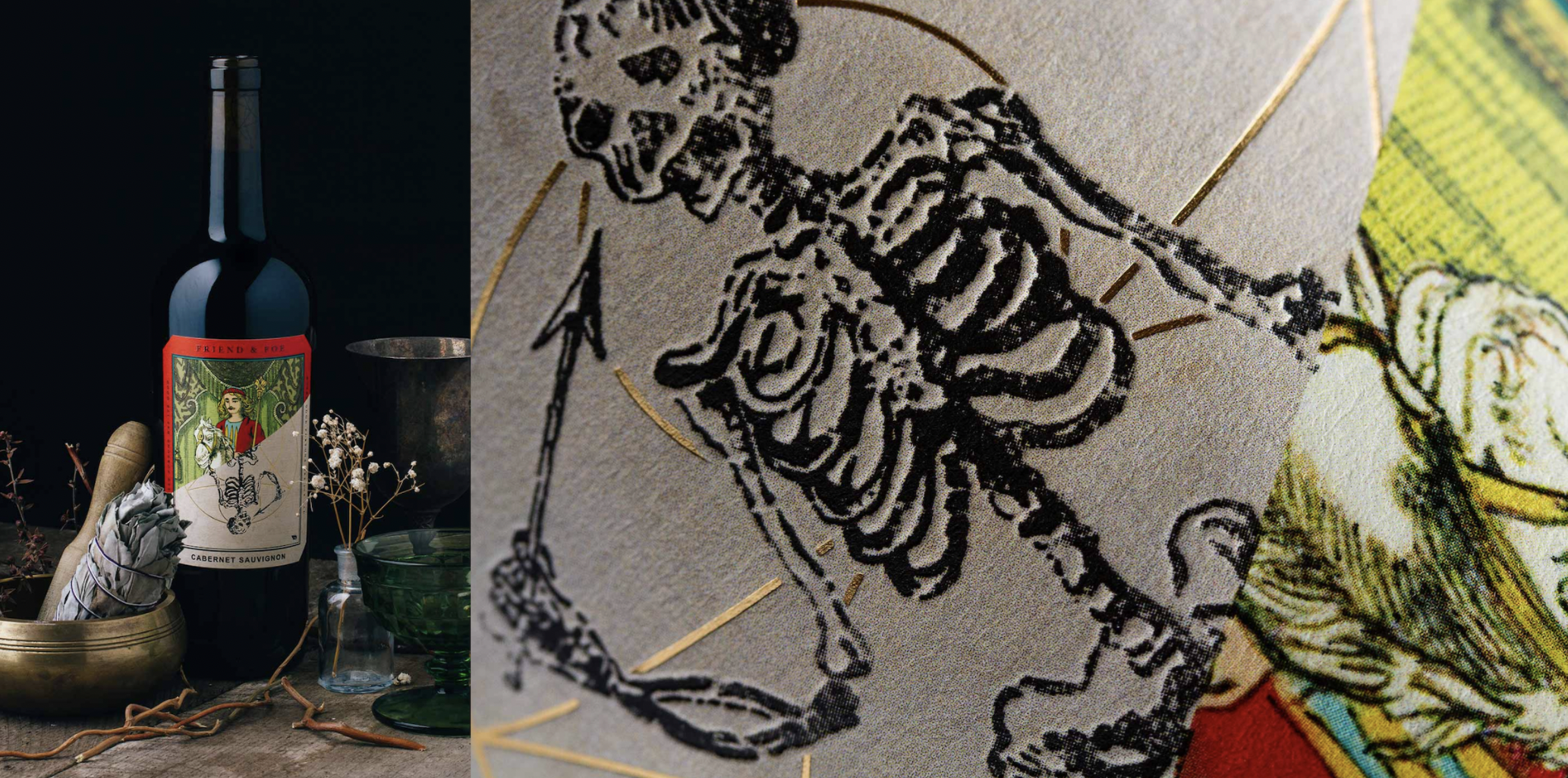
Makers & Allies worked with them to develop a brand identity that was both visually appealing, including elaborate illustrations. The colored, more intricately drawn half of each card provides a glimpse of what good fortune a reading can predict. The monochromatic sketches of the Death card, on the other hand, represent the potential for a morbid future. Putting the cards together as though the Death card represents the reversed version of each card seems to suggest that, with every win, comes a loss.
As the tarot card turns, your fate is revealed—for better or for worse. Each intricate illustration (Lady Justice, The Knight of Cups, The Magician, and The Sun) are splintered by a cross-section of the grinning spectre of death.
Embossed, spot varnished details highlight fortune’s side, while embossed gold foil underscores fate’s macabre plans in store. Blessings are always paid due by their shortcomings when their reverse hangs in the balance. How will your hand be dealt?
The Dieline is a bespoke packaging design and sustainability blog.
Founded in 2011 by Andrew Gibbs, The Dieline is a source of news and inspiration for designers, packaging designers, and those in the sustainability space. With a humorous, unique spin on package design reporting, The Dieline is the design community’s go-to source for designers looking to have their creativity sparked.
As a writer for The Dieline, I wrote over 100+ articles. For more, click here.


